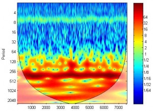
Let’s say you collected some brain data (time series) using NIRS while the participants were performing a task (say finger tapping), and you use the wt function in the “Cross Wavelet and Wavelet Coherence Toolbox” (link dead. Please go to the bottom of this post to find how to download) to plot the power of the signal in both time and frequency domain. What does the plot tell you?

First, you can see there is a clear band around period 8, corresponding to frequency ~1Hz (remember our sampling frequency is 10Hz). This band is actually caused by heart beating. While in most cases you will probably treat this physiological signal as noise and remove it using filtering techniques, the existence of this band should be comforting to you: it indicates that your signal contains something real. If your NIRS device for whatever reason doesn’t measure real brain activity (e.g. the probes did not contact the head well), you won’t get this band.
Second, you can see there is a red band around period 256. It indicates this signal correlates with the experiment task very well. The task used is a finger tapping task: the subject (actually myself) tapped his right hand finger for 10s, then rest for 20s, and then repeat for 20 times. The period of the task is thus 30s. The red band is actually of period 30s. So for a task that is periodical, you can use wt to check if the signal collected demonstrates similar period.
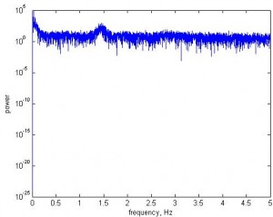
Well, why use wt but not FFT? The visualization of FFT is much worse. Here I plot FFT of the same signal (y-axis in log scale).

First it is kind of boring. You do see a bump around frequency 1.4Hz which is heart beating. That’s good, even though it is not as distinguished as in wt. It is hard to see the 30s (or 0.03Hz) band, while in wt plot the band is very clear.
To download the “Cross Wavelet and Wavelet Coherence Toolbox”, please enter
https://www.alivelearn.net/?p=1561
Related:
Wavelet Coherence
Handy programs to visualize NIRS data (4): wt


Just to be clear, saying “the visualization is worse” of the Fourier transform is misleading. If you use a short-time Fourier transform with sliding windows, instead of doing the FT across the whole time period, you’ll get very similar results.
In fact, a Fourier transform using a Gaussian envelope is mathematically *identical* to the Morlet wavelet-based analysis (Bruns 2004). The people claiming some superiority for Morlet wavelet-based methods for neuroimaging data are mistaken.
You are right. Sliding window FFT will produce similar result.
Very interesting post. A trivial question: I am wondering if you can show more details about how can we say that “The red band is actually of period 30s. “? Isn’t that period 256 in terms of wavelet?
It is a really nice blog. I bookmarked it and plan to read it all.
The sampling frequency is 10Hz. So 256/10 = 25.6s
In cwt plot what the peak tell us about the input signal, please mention in detail……
The plots generated after the cwt have some peaks. what does those peak points tell us about the input signal.
Please mention clearly i am beginner in wavelet transforms..
@karunya
In the wavelet transform plot, peaks mean that the power at this frequency/time is higher than neighbor.
Dear Xu Cui,
your blog is, simply put, an eye opener to many and shades a strong light in to this seemingly elusive world of wavelets.
I just want to ask you the following:
(1). In your last comment, you wrote, “In the wavelet transform plot, peaks mean that the power at this frequency/time is higher than neighbor.” What exactly does power mean? What will its physical interpretation be? and what will be its unit?
(2). the color bar besides the plot, does it represent the power for which i asked in the above question?
Thank you for your help.
Dear Xu Cui,
Sir, I am working on well-logging geophysical data. but I can’t interpret the wavelet spectrum. what do I do?
please help
Dear Sir,
I am working with yearly rainfall time series. I need help in interpreting the CWT coefficients which I have plotted. I also want to plot wavelet power spectrum. Presently I have squared the absolute coefficient values and plotted it. I don’t know whether it is correct.
Kindly help me.
Dear Dr.Cui:
When I did wavelet transform for my fNIRS data. It’s a litter werid that the oxyHb and deoxyHb did not had heart beating band! But!! For the totalHB data, It had!! It’s normal? Based on these results, did the queality of your data is ok or not?
Best wishes
Jiaxin
@Jiaxin Yang
It’s unusual and I personally have not seen it before. But I would not say the data quality is bad based on lack of heart beat band.
@Xu Cui
Thanks a lot.
@Xu Cui
So, you usually used the oxyHb data to do wavelet transform and do further analysis,right? The figure you showed was also based on the oxyHB data?
@Jiaxin Yang
I usually use oxyhb but you can use either.