In case you need to visualize your time series in both time and frequency domain (or just frequency domain), you can use the wt (wavelet transform) function in the Cross Wavelet and Wavelet Coherence toolbox by Grinsted et al. I often find the color representation makes it easy to discover patterns.
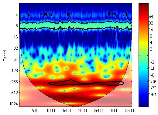
Here is an example of the wavelet transform of a NIRS time series:

As you can see, there is strong periodicity around period 300 (i.e. 30s because the sampling frequency is 10Hz) and 10 (i.e. 1s). The NIRS signal was obtained from a task with period of 30s and that explains the 30s periodicity. The 1s periodicity is from heart beating and it’s seen in a lot of NIRS data.
If you need to discover patterns of the correlation between two time series, you may use the wtc function in the same toolbox.

