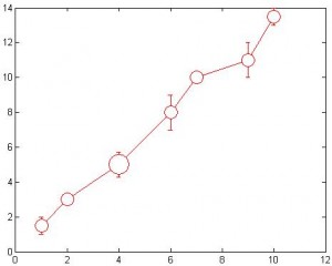
Let’s say you have two correlated variables, x and y. You may have more then one data points with x=10 and y=5. But if you do a scatter plot all these data points of the same value will become a single dot. You may want to use circles with size proportional to the sample size (i.e. # of data points). plot2 does this.

In the plot above, you can see there are more data points at x=4.
plot2 can also group all data points with the same x value together and average them. For example, you have 3 data points (4,5),(4,6),(4,7) and you may want to plot the average point only (with bigger circle). There is one parameter in plot2 that allows you do this.
Type help plot2 to see how to use it.
Download the source code here: plot2.m


